Knowledge community · web and mobile · Case study
Designing a community before it had any members.
Duggup is a knowledge-sharing community for software engineers, data scientists, DevOps engineers and technical leads. I joined as founding product designer and shipped v1.0 across web and mobile, working with Arpit Bhayani.
- Product
- Duggup
- Role
- Founding product designer
- Timeline
- 6 months · v1.0 at five
- Platform
- Web and mobile
- Tools
- Figma · Framer
- Built with
- Arpit Bhayani
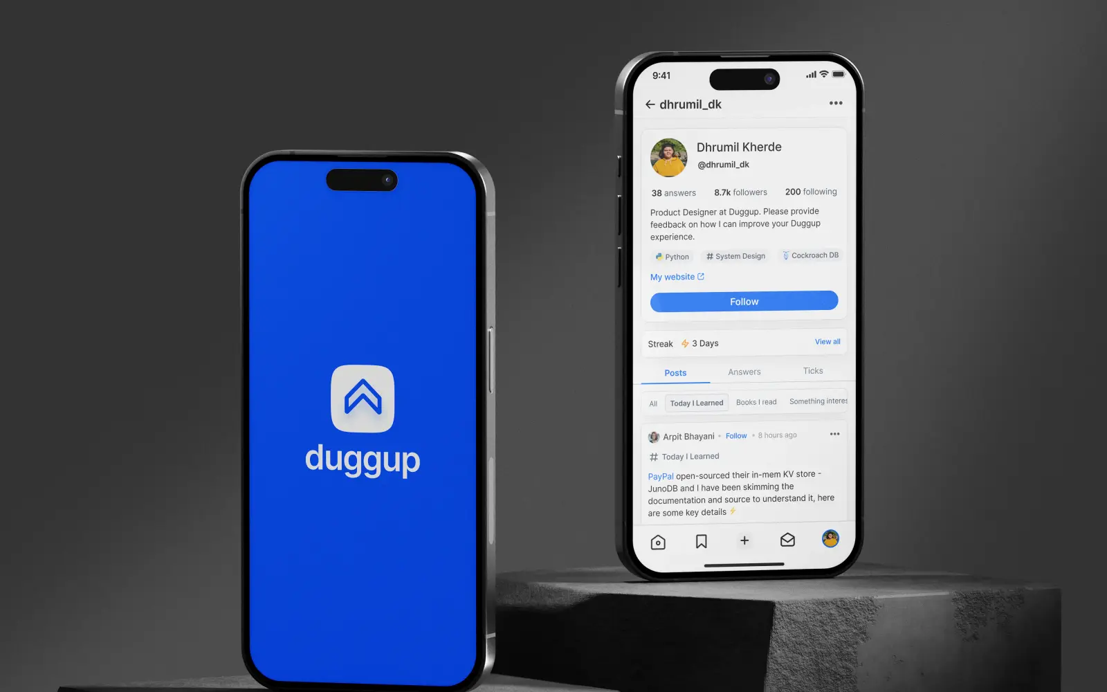
Product render from the shipped v1.0 · every capture below is from the mobile build · harvested from the published case study, July 2026
The room was empty
Engineers who have been doing the work for a decade want to pass some of it on. People three years behind them want to find it. Both groups are large, and they mostly miss each other, because the places they meet are tuned for something else: reputation on Stack Overflow, argument on Hacker News, reach on LinkedIn.
That was the pitch, and the pitch was not the hard part. The founding design problem was smaller and worse. A community product is worth nothing on the day it launches and has to feel worth returning to anyway. Every screen had to hold up with almost nothing in it, and then keep holding up once it filled.
An empty feed is not a problem you can style your way out of. It is a problem about what the product asks a person to do in the first ten seconds.
So the work split into two questions that ran through everything else. What is the cheapest useful thing a new member can contribute, and what gives them a reason to come back that does not depend on anyone else having shown up yet.
Who it had to work for
Not “developers”. The brief named roles and career stages, and those two axes decided what the first screen was allowed to assume about the person reading it.
Engineers, and the jobs next to engineering
Software engineers, data scientists, DevOps engineers and technical leads. Adjacent enough to share a feed, different enough that topics had to do real filtering work.
Arrives to find things
Reads far more than it writes. Will contribute, but only while contributing stays cheap and the result does not sit there with nothing under it.
Arrives to pass things on
The scarce input, and the first to leave. Writes something considered, and stops writing if it lands in front of nobody.
Those two halves want opposite things from the same launch. The junior half needs the room to already have content in it. The senior half needs the room to already have readers in it. Neither is true on day one, and only one of them can be faked, which is why the design leans on the cheap end of the ladder rather than on the expensive end.
What I actually knew
Secondary research, no primary interviews. I would rather write that down plainly than describe a study I did not run.
What I did do: competitor analysis across Quora, Hacker News and Stack Overflow, looking at how each one ranks contributions and what behaviour that ranking produces. Reading technical community discussions on Reddit and specialist blogs. Published surveys and reports on tech careers, for the upskilling and discovery complaints people write down when nobody from the product is in the room.
Four problems kept recurring, and they became the frame every feature was argued against.
Too much, none of it aimed
Plenty of material exists. Almost none of it is filtered to what this person is working on right now.
No visible next step
People could describe the job they had and not the one after it. Growth had no shape they could point at.
Learning with no structure
Stacks move faster than anyone’s reading habit. Without a system, upskilling becomes a browser full of open tabs.
Remote removed the corridor
The informal knowledge that used to travel between desks does not have a replacement, and mentorship went with it.
Source: competitor analysis, technical community forums, and published career surveys · no primary user interviews were conducted
Four ways in
The empty room gets solved by making the cheapest useful contribution genuinely cheap, and then giving that contribution somewhere to grow. Duggup ended up with four ways to put something into the product, and the distance between the bottom rung and the top one is the whole design.
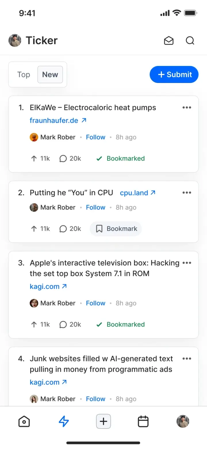
Rung one. A title and a URL, ranked. The shape is borrowed on purpose: this audience already knows what to do with it.
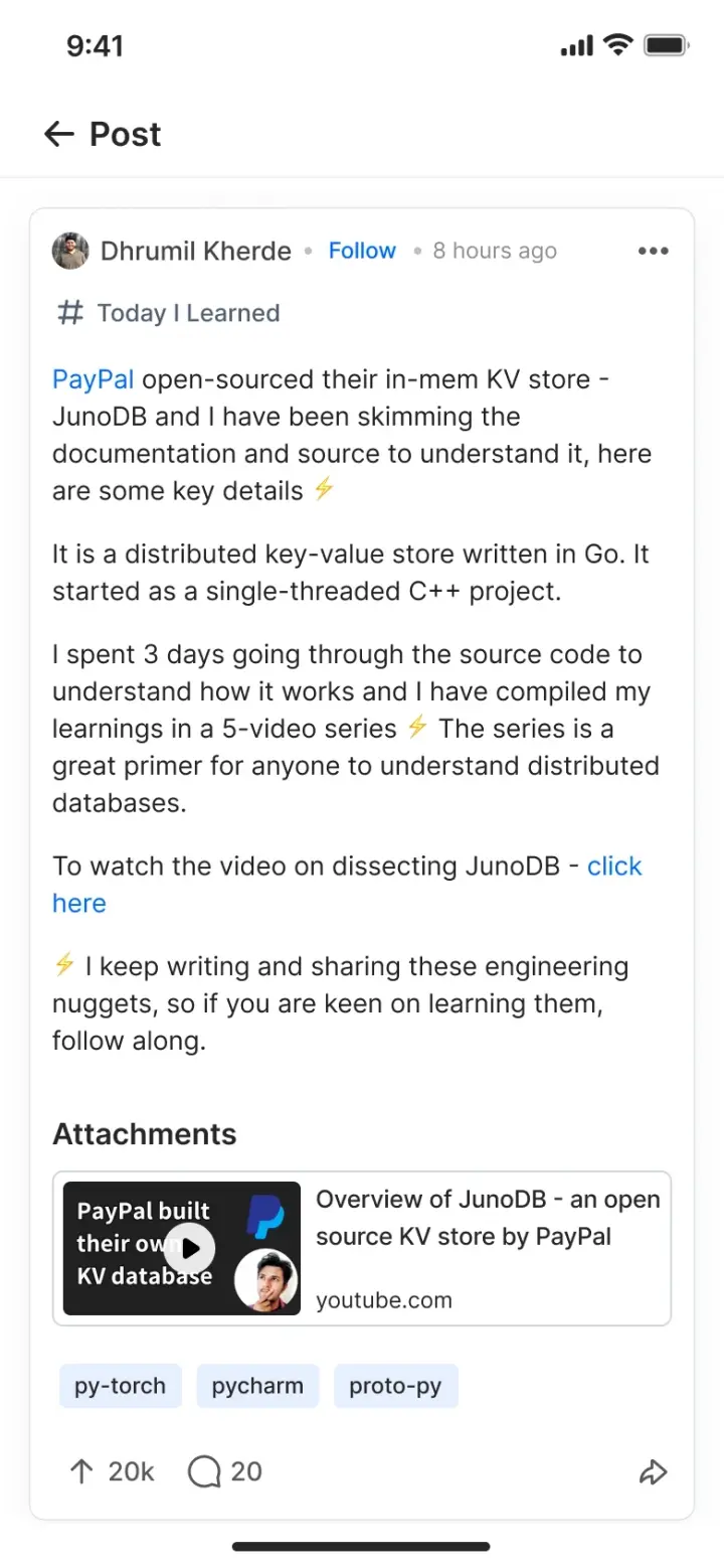
Rung two. A short written post about one thing you learned, with room for an attachment and tags.
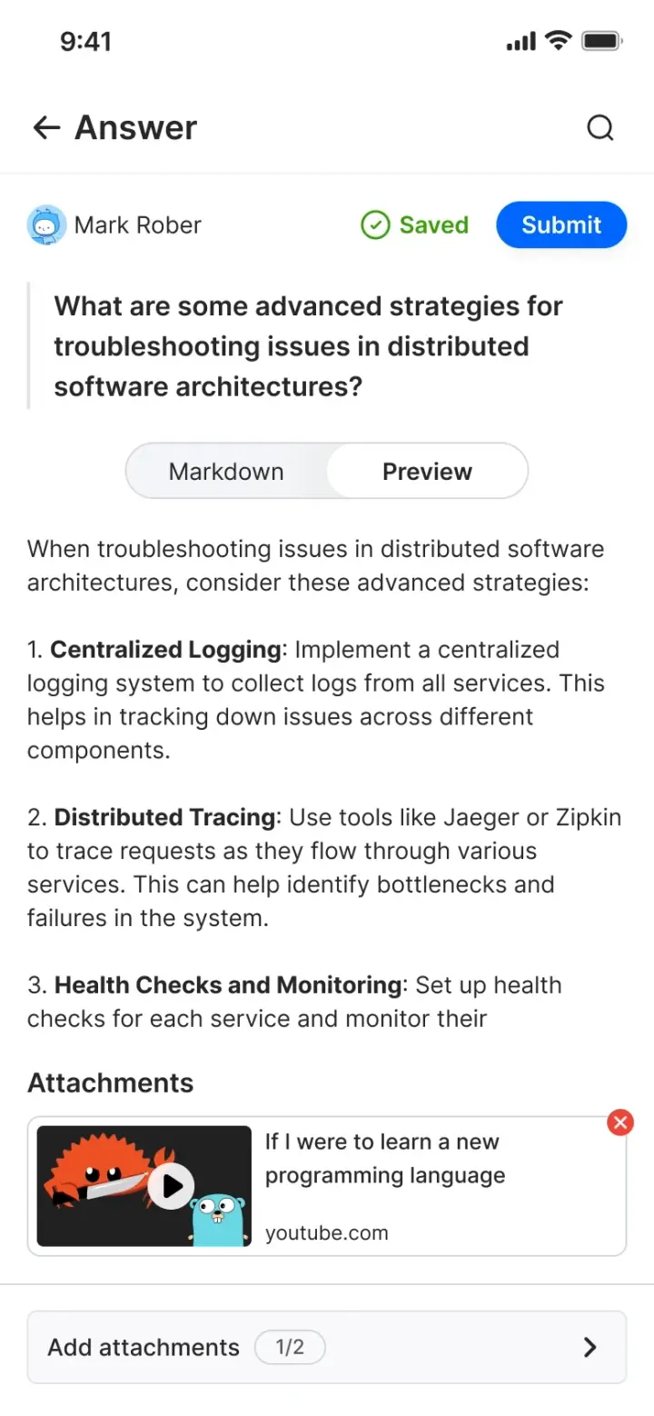
Rung three. Answering someone. The one rung that needs another member to have gone first.
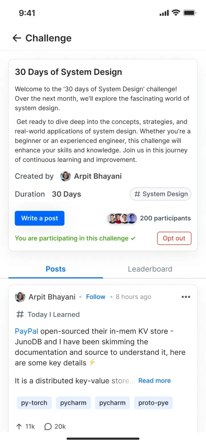
Rung four. A commitment measured in weeks, made in front of other people.
Make the cheapest contribution a link
The bottom rung had to cost about ten seconds, because anything more expensive will not happen on a platform with no audience yet. A tick is a title and a URL.
It earns its place twice. It fills the room, and it gives the people who will never write a post something real to do, which keeps them in the product long enough to read one.
Top and New, and a submit button that is never more than one tap away. Ranking is the only editorial control.
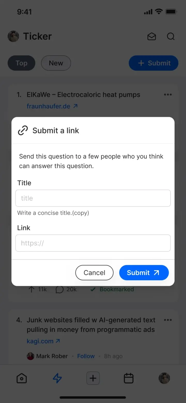
Two fields. Adding a third would have moved this rung up the ladder, which is the one thing it could not afford.
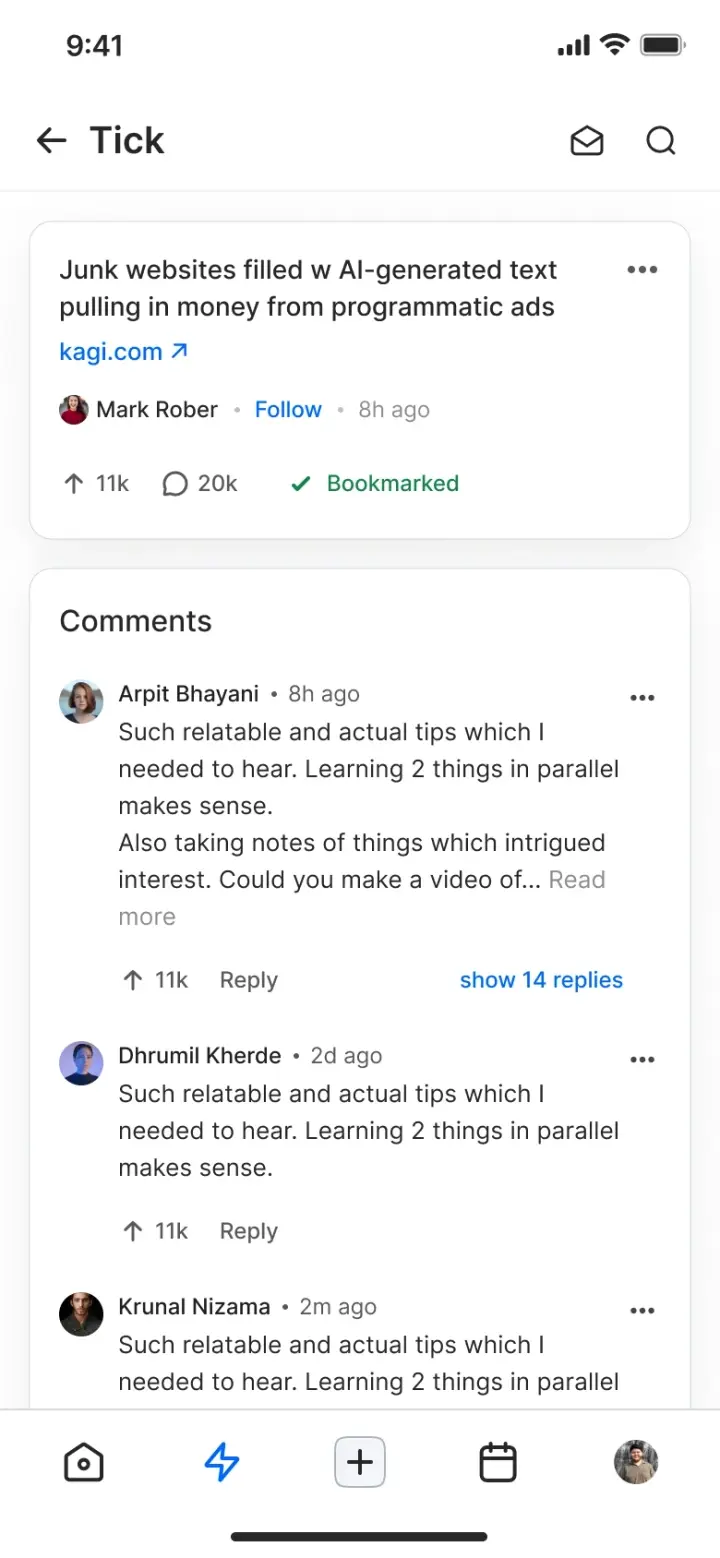
The thread underneath is where ten seconds of effort turns into a conversation. That is the reason the cheap rung comes first.
Ask a narrower question than “post something”
An empty box gets nothing from a person who is not sure they have anything worth saying. The composer asks a smaller question and hands over three ready-made answers to it.
Naming the kinds also makes the feed filterable later, so the same control that lowers the barrier to writing is the one that makes reading tolerable at scale.
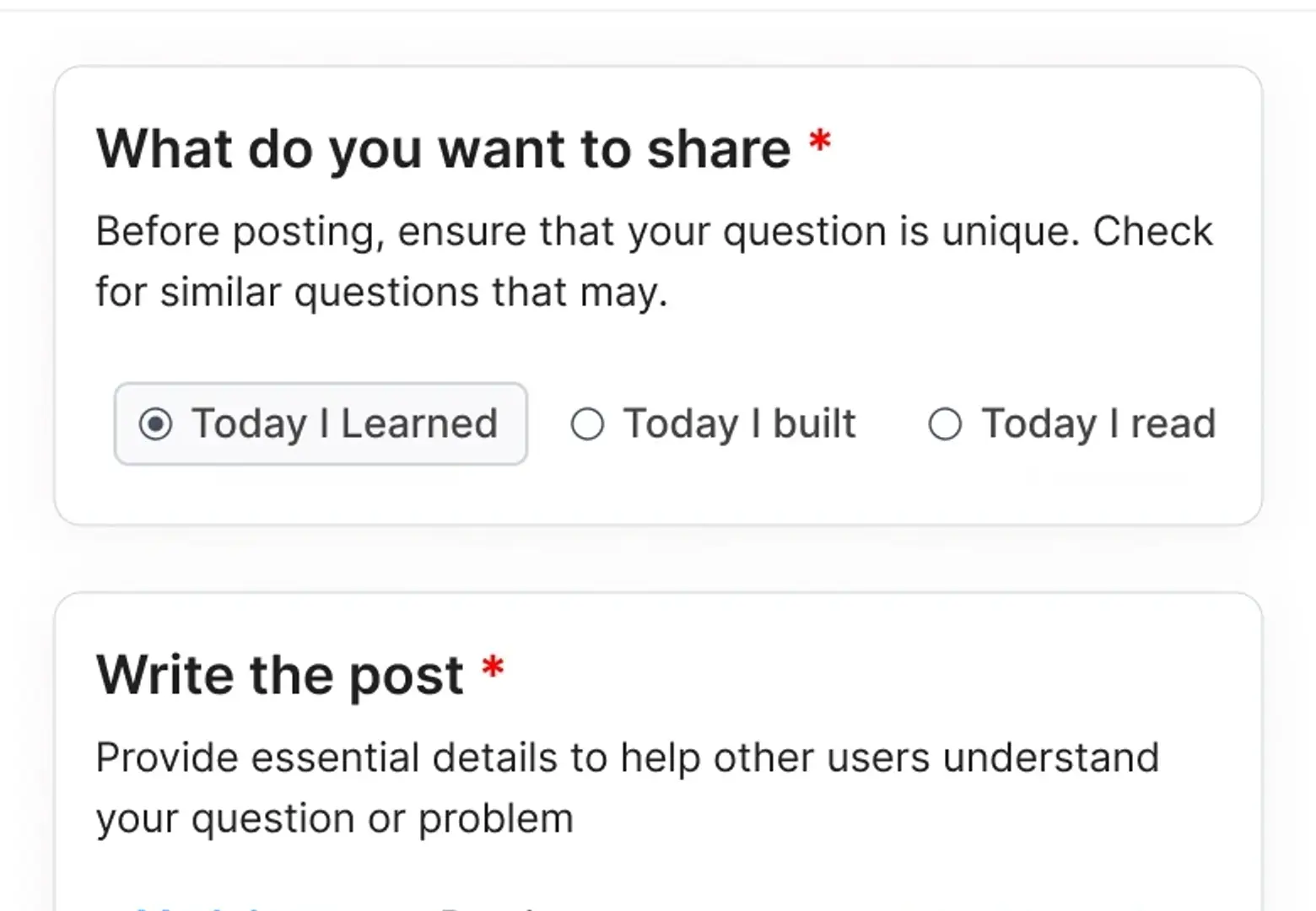
- 01 / The promptToday I learned, today I built, today I read. Each one is a sentence someone can already finish.
- 02 / The defaultOne is preselected, so the screen is never asking a question the reader has to answer before they can start.
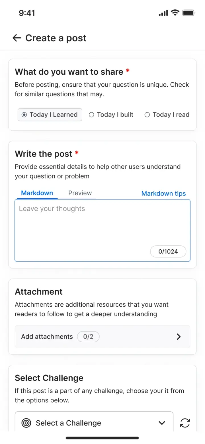
One column, in the order a person actually works: what kind, then the writing, then the extras.
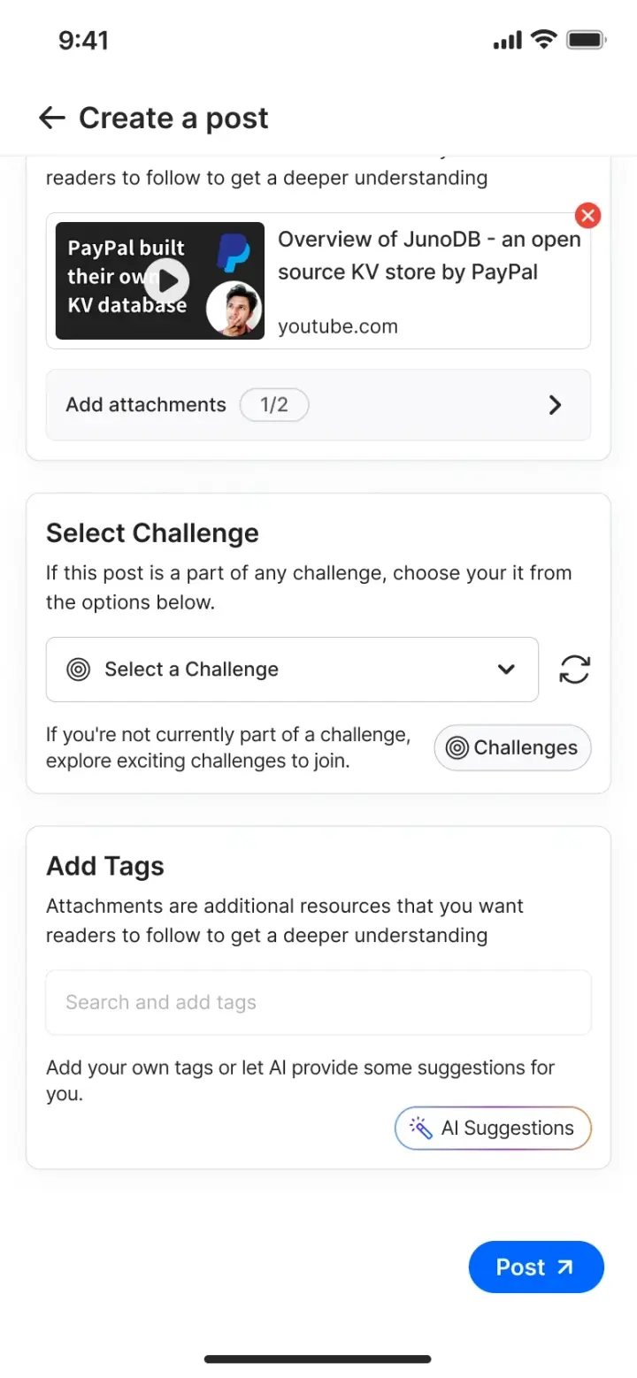
Tags are the thing people skip, so the field offers suggestions rather than demanding vocabulary.
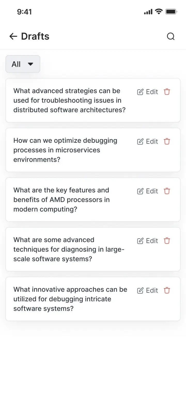
Drafts exist because the top two rungs take long enough to be interrupted. Losing that work once is enough to stop someone writing again.
Let the audience write the way it already writes
The answer composer is markdown with a live preview, and attachments are capped at two. Engineers paste code, and code that does not survive the paste is the fastest way to lose the person you most wanted to keep.
The preview tab is not a nicety here. Markdown without a preview asks the writer to hold a rendering engine in their head while composing a technical explanation.
The question stays pinned above the editor, so a long answer never drifts away from what was asked.
The published result. Formatting, links and attachments all survive, which is the only proof the composer worked.
Reasons to come back
Contribution solves the first visit. Retention is a different problem, and on a platform this small it cannot be built on other people showing up, because most days they will not.
Give people a clock that is not other people
Challenges run 7, 14, 30 or 100 days. Joining one is a commitment you make to yourself, in public, with a leaderboard and a participant count next to it.
It works at 32 participants and it works at 32,000, which is the property the rest of the engagement layer did not have. Leaving is a first-class action rather than something you accomplish by going quiet.
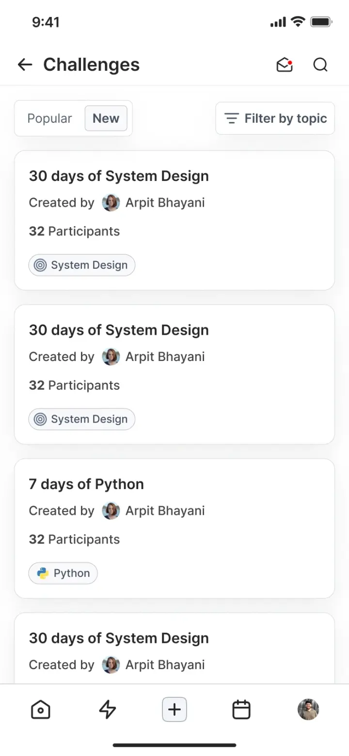
Popular and New, filtered by topic. The participant count is on the card because it is the thing that decides whether you join.
Your own participation state sits next to the action, so the page never makes you guess whether you are in.
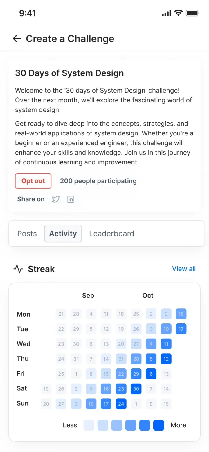
Activity is scoped to the challenge, so a 30-day commitment gets its own 30 days rather than a lifetime graph.
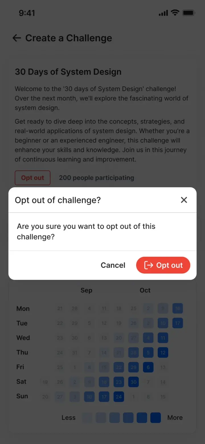
Opting out is confirmed once and then done. No penalty screen, no persuasion, no dark pattern on the way out.
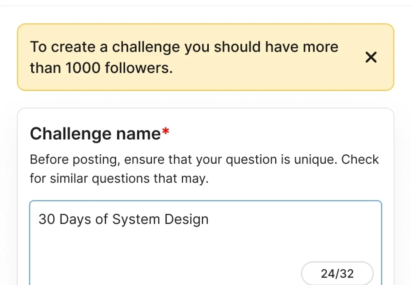
- 01 / Stated up frontThe requirement is the first thing on the screen, not a validation error after the form has been filled in.
- 02 / What it protectsA challenge with no audience is a leaderboard of one. The gate holds creation back until someone has people to finish in front of.
One activity graph, at four densities
The same object appears as a single line on a profile, as a week when that line is expanded, as quarters on its own page, and scoped to a challenge inside the challenge.
It is deliberately the graph engineers already read every day on their own contribution profiles. Borrowing the shape meant nobody had to be taught what a filled square means.
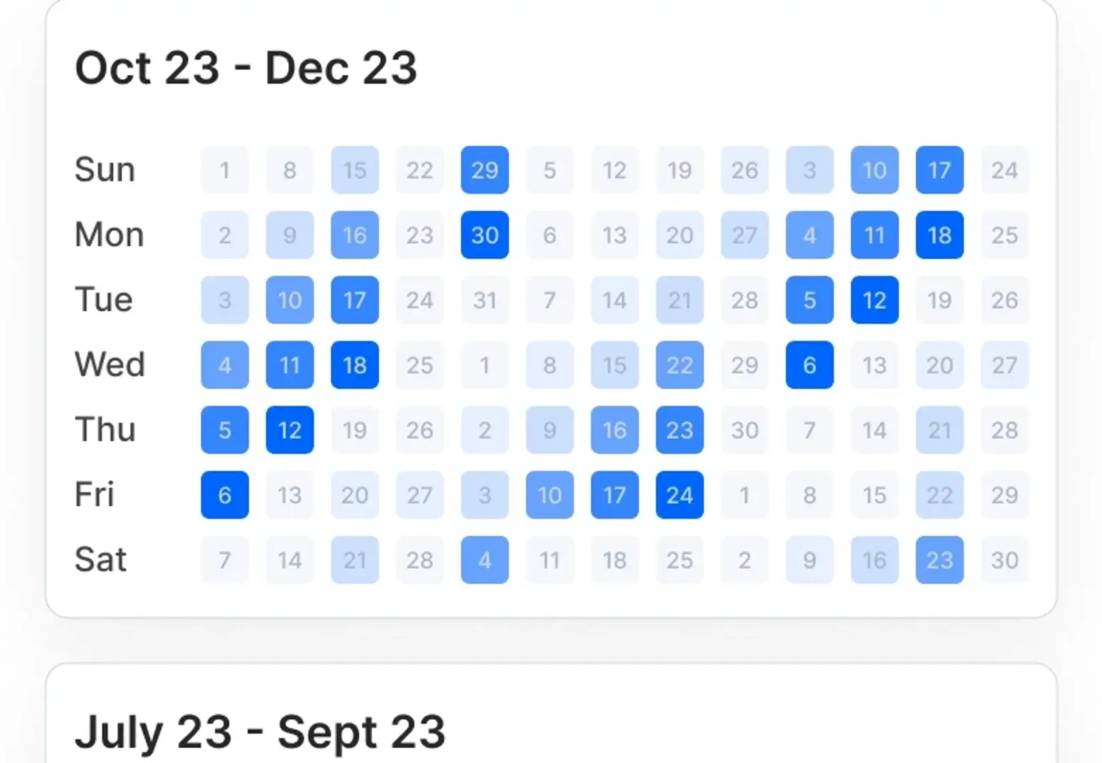
- 01 / Weekday rowsRows are days of the week, so a habit that only happens at weekends is visible as a band rather than as scatter.
- 02 / Readable at restThe date sits inside the square. Nothing about the graph depends on a pointer, which is what made it survive onto a phone.
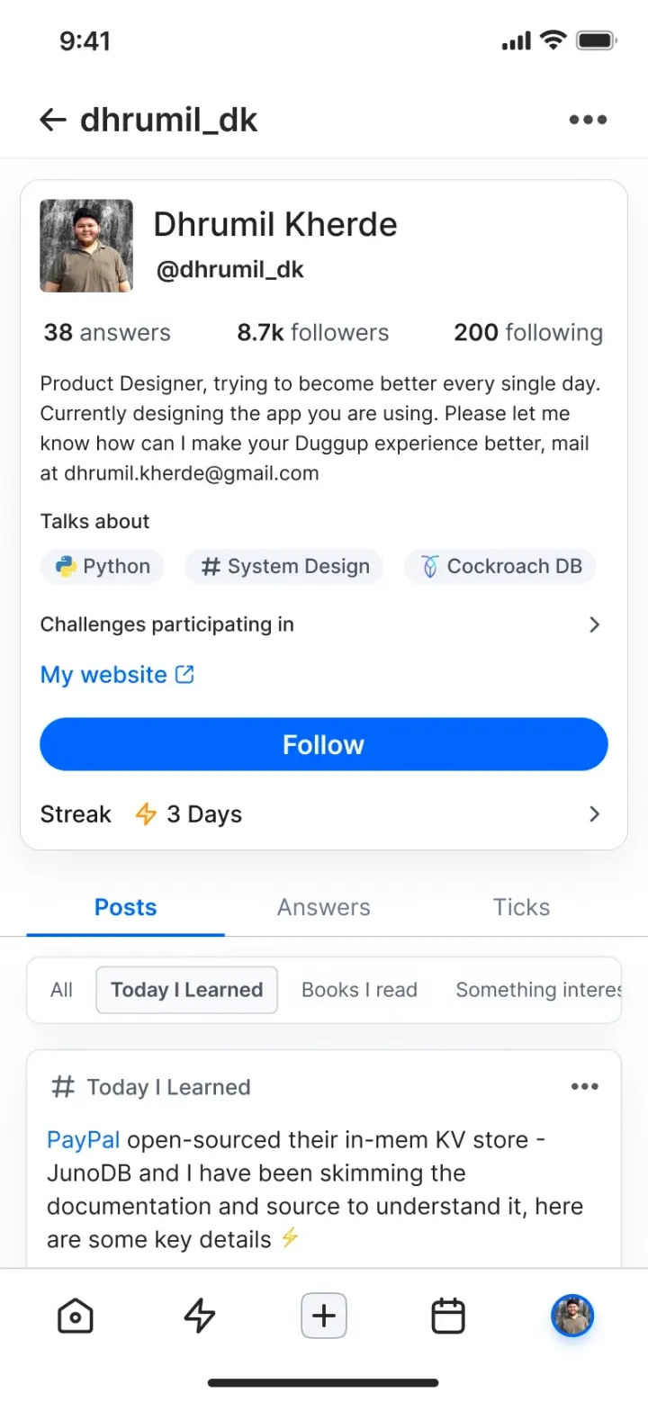
On a profile it is one line. A streak count earns its place next to follower counts without taking a section.
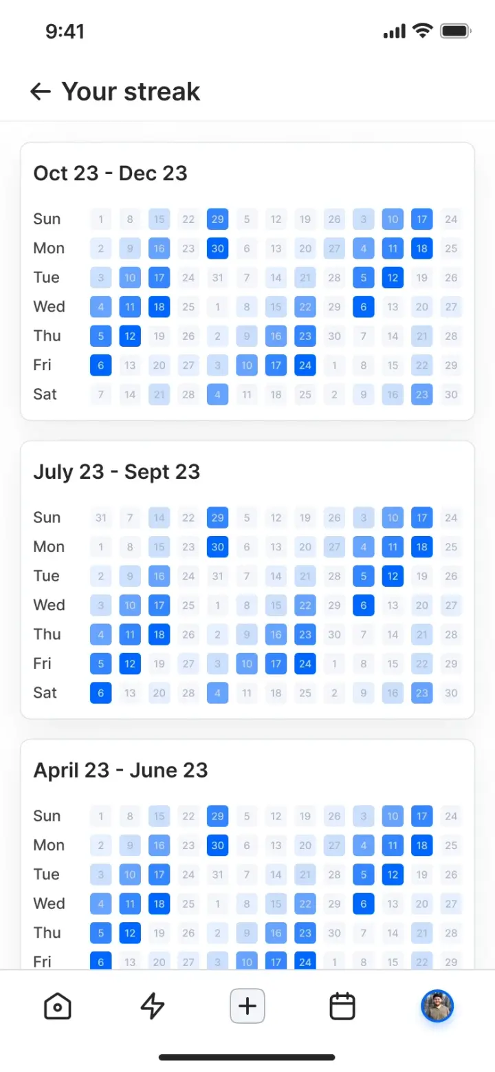
Its own page is quarters, stacked. This is the only place the full history is worth the vertical space.
Inside a challenge it is scoped to the challenge, so the graph answers the question the page is actually about.
Answer before the query
Search is where a small platform looks smallest, because an empty result is a very clear statement about how much is here. So the search screen does not wait to be asked.
It opens with trending questions and people worth following, and the wait itself is designed rather than left to a spinner. On a slow query the loading state is the experience.
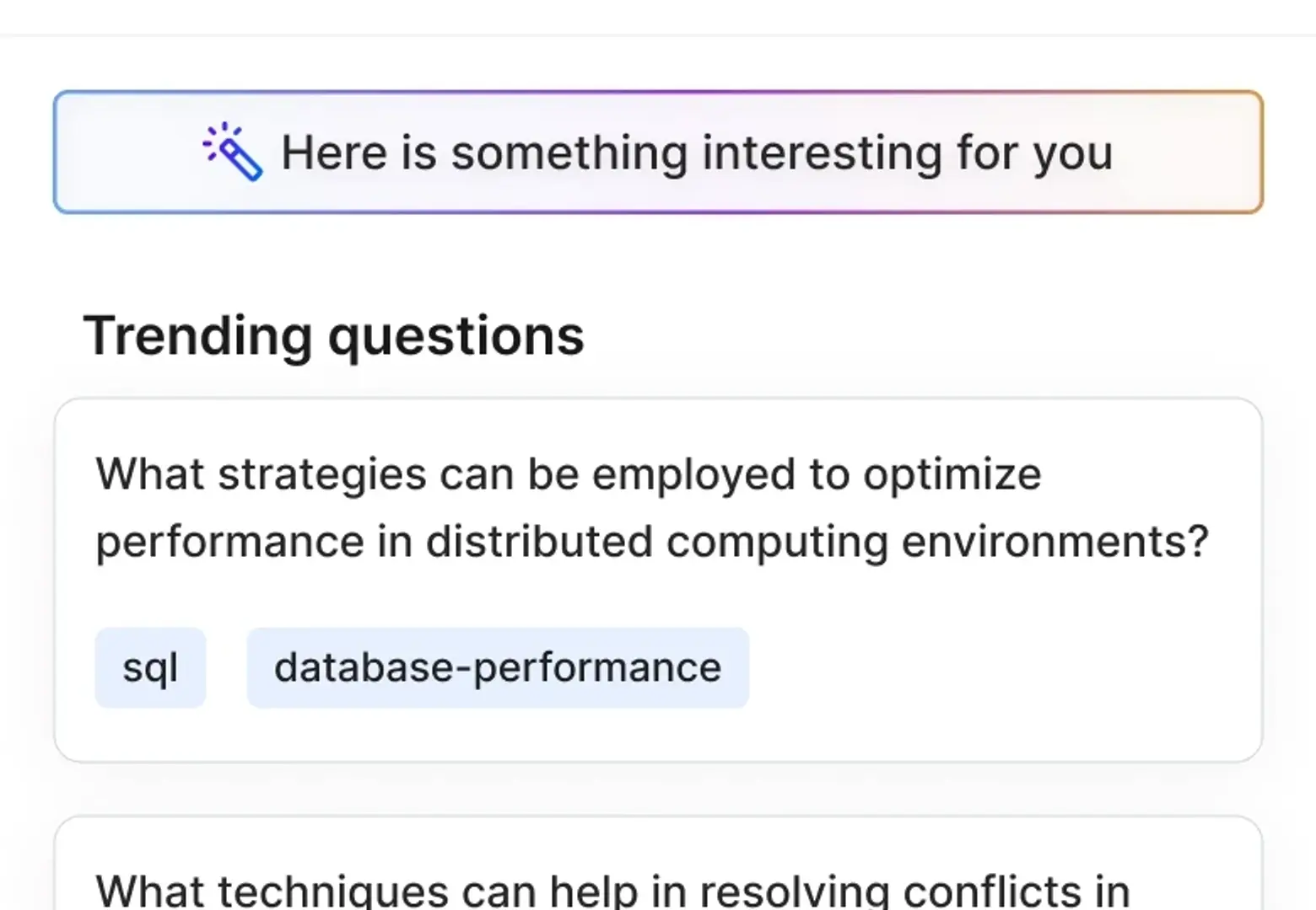
- 01 / Surprise meThe entry point for a person who does not have a query, only an idle minute.
- 02 / Tagged resultsEvery suggestion carries its topics, so one tap turns serendipity back into a filter.
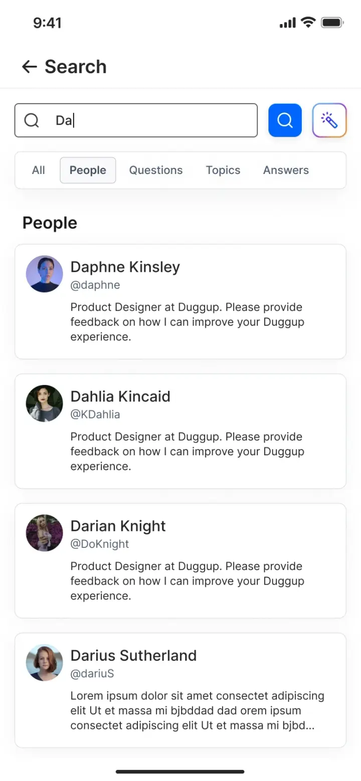
Typed query. Results are split by kind, because looking for a person and looking for an answer are different jobs.
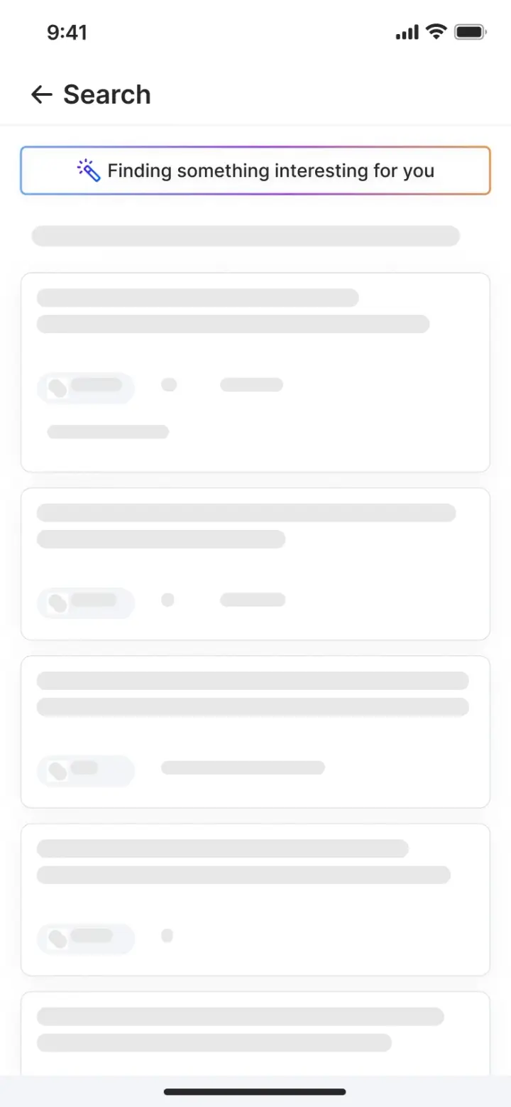
The wait, drawn as the shape of what is coming. A spinner tells you nothing is happening yet; this tells you what will be there.
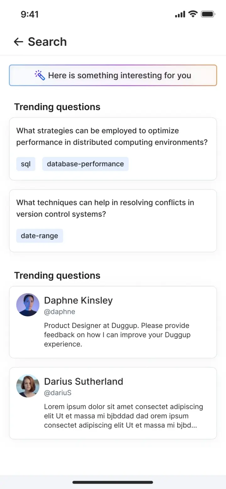
The answer. Same layout as the skeleton, so nothing jumps when it lands.
The part that took money
Events were the one place where the product stopped being social software and became a transaction. Community meetups and summits, online and in person, with seats, prices and a real checkout behind them.
Tolerance for a vague screen goes to zero once money is involved, and the surrounding product was still new enough that a person had no reason to extend it any trust. So the flow states everything before it asks for anything, and stays reversible after the payment lands.
- BrowseFiltered by meetup, summit or the ones you are already registered for. Seats remaining and a filling-fast, open or closed state sit on the card, before the tap.
- EventDate, time, seats, venue and a map link above the description. Speakers and host below it, because who is running it is the thing a paid ticket is actually buying.
- RegisterEmail, phone, currency and an optional GST number. The refund policy is a checkbox on this screen, not a link found afterwards.
- CheckoutTicket price, tax and total broken out separately, with the contact details repeated and editable in place.
- ConfirmationAn order ID and a date, then the event page itself changes to registered and offers a cancel. The exit is visible from the moment the money clears.
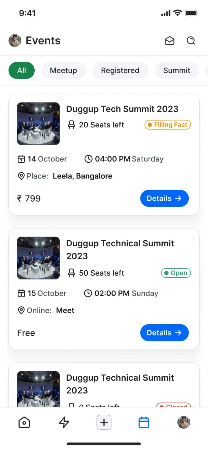
Seats and status are on the card. A closed event says so before it costs anyone a tap.
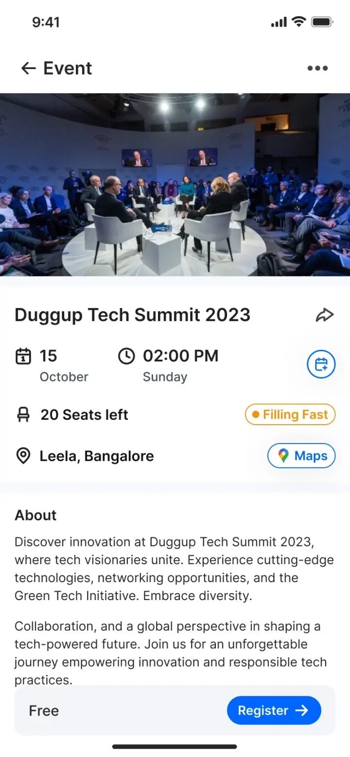
The commercial facts sit above the description, in a fixed order that repeats across every event.
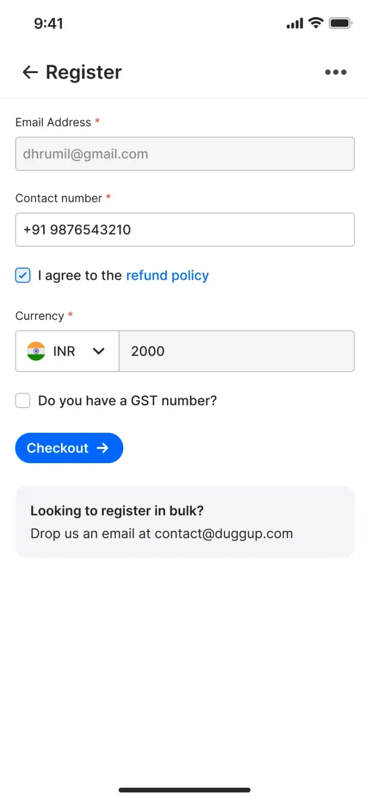
Currency and tax identity are asked once, here, rather than surfacing as a surprise at the payment step.
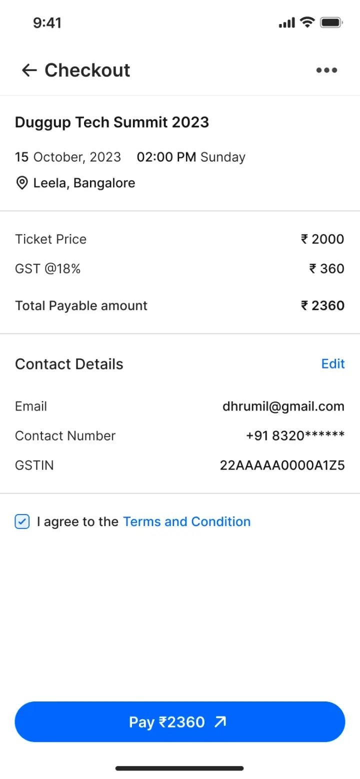
Tax is a separate line. The total is the last thing read before the only irreversible button on the flow.
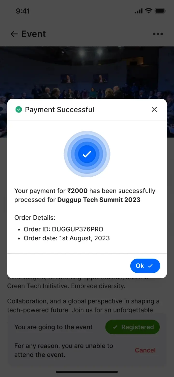
Order ID, date, and a cancel route still on the page. Paying is not designed as the end of the person's control.
What it was measured on
The team tracked daily and monthly actives, session length, frequency of use, retention and churn, in Amplitude. Those were chosen before launch, which matters more than the list itself: the engagement layer was designed against retention and churn rather than being decorated and measured afterwards.
What this record is missing
Every capture on this page is from the mobile build. The web product shipped, parity between the two was the part of the engagement I was most pleased with, and no capture of it survived into the archive this case study was rebuilt from.
I would rather say that than put a phone screen under a caption about the web app. The claim about cross-platform parity is therefore a claim, not something this page shows you.
What I would validate first
The honest weakness of this project is section 03. Every decision on this page is defensible from first principles and from how comparable products behave, and not one of them was checked against a person in the target audience before it shipped. On a product about human motivation, that is the gap that matters most.
What I took away is narrower than the feature list suggests. The useful move was ranking the ways in by cost and then designing the cheapest one properly, instead of designing the most impressive one and hoping the cheap end took care of itself. If I picked this up again, I would start with the questions below rather than with a new feature.