Clinical intelligence platform · Case study
Turning scattered medical records into clear clinical decisions.
N1 Care is an AI clinical intelligence platform for licensed healthcare professionals. I rebuilt the doctor-facing workspace around one practical question: what does the clinician need to understand, and what do they need to do next?
- Product
- N1 Care, by N1 Healthcare
- Role
- Design lead · sole designer
- Timeline
- Aug 2025 to Feb 2026
- Users
- Doctors and clinical staff
- Team
- ~23 people, one designer
- Scope
- Audit, UX, UI, prototypes, testing
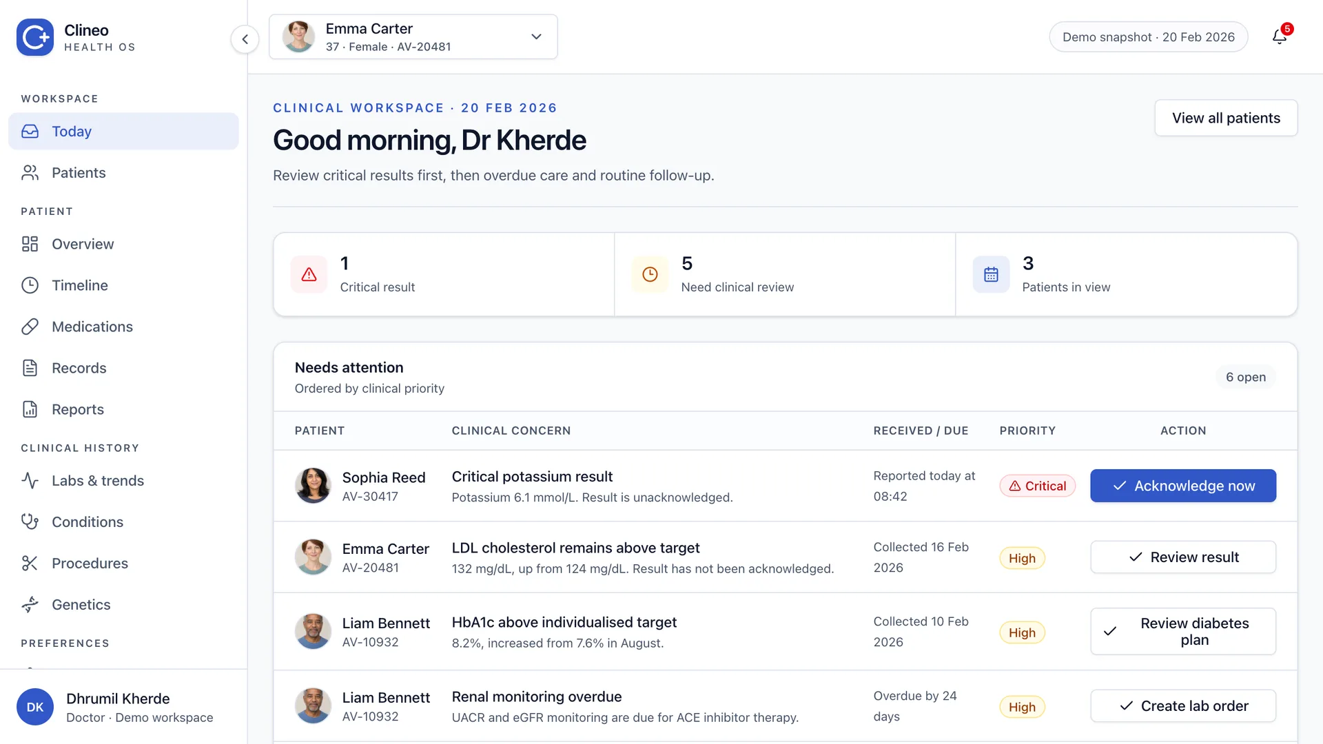
Rebuilt demo · placeholder product name · fictional patients · local-only data · no client service connected
What I inherited
The product had grown in Bubble.io before the team began moving it to React. It could already collect records, extract clinical data and generate reports. But the interface had accumulated the kind of debt that makes a capable product feel slow and difficult to trust.
The staging environment repeatedly timed out on everyday create, search and pagination actions. I cannot prove Bubble itself caused every delay, but the experience was slow enough to interrupt basic review work.
Open UI/UX issues
The migration carried a visible backlog of layout, interaction and consistency problems.
Interactions to one graph
There was no useful trend signal until a doctor opened each biomarker and changed tabs.
Button variants
Similar actions looked and behaved differently across the product.
Documented colours
The visual system had more options than the interface could use consistently.
Source: internal product audit and migration records, Jan–Feb 2026
The real problem was interaction debt
A complex patient can arrive with years of labs, medications, diagnoses, procedures and scanned reports. The information exists, but it is spread across formats and screens. The doctor still has to assemble the story while making a decision.
The interface had the same problem. Each module could display its own data, yet the full workflow never made priority, safety, chronology and evidence feel connected.
Evidence arrived in pieces
PDFs, images, lab results and historical notes each carried part of the clinical picture.
Every module felt separate
A doctor could find the data, but moving between areas made the story harder to follow.
Some workflows stopped early
An alert or button could appear without showing what changed after the doctor acted.
The job was to make the next decision clear without hiding the evidence behind it.
How I framed it
I stopped treating the home screen as another dashboard. Four questions decided what belonged in the first layer and what could wait.
Four linked questions organise clinical review: priority, patient context, change over time and source evidence. Choose a question in the diagram or list to inspect the related design decision. Previous and next controls, plus the arrow keys, move between steps.
Step 1 of 4: Priority
I reviewed the existing screens, traced incomplete actions, compared clinical interface patterns and tested the rebuilt flows in the local React app. Where I did not have clinical usability data, I treated the outcome as a design direction rather than a proven impact.
The product decisions
The same rule guided every screen: compress the signal, then let the doctor expand the context and the source evidence.
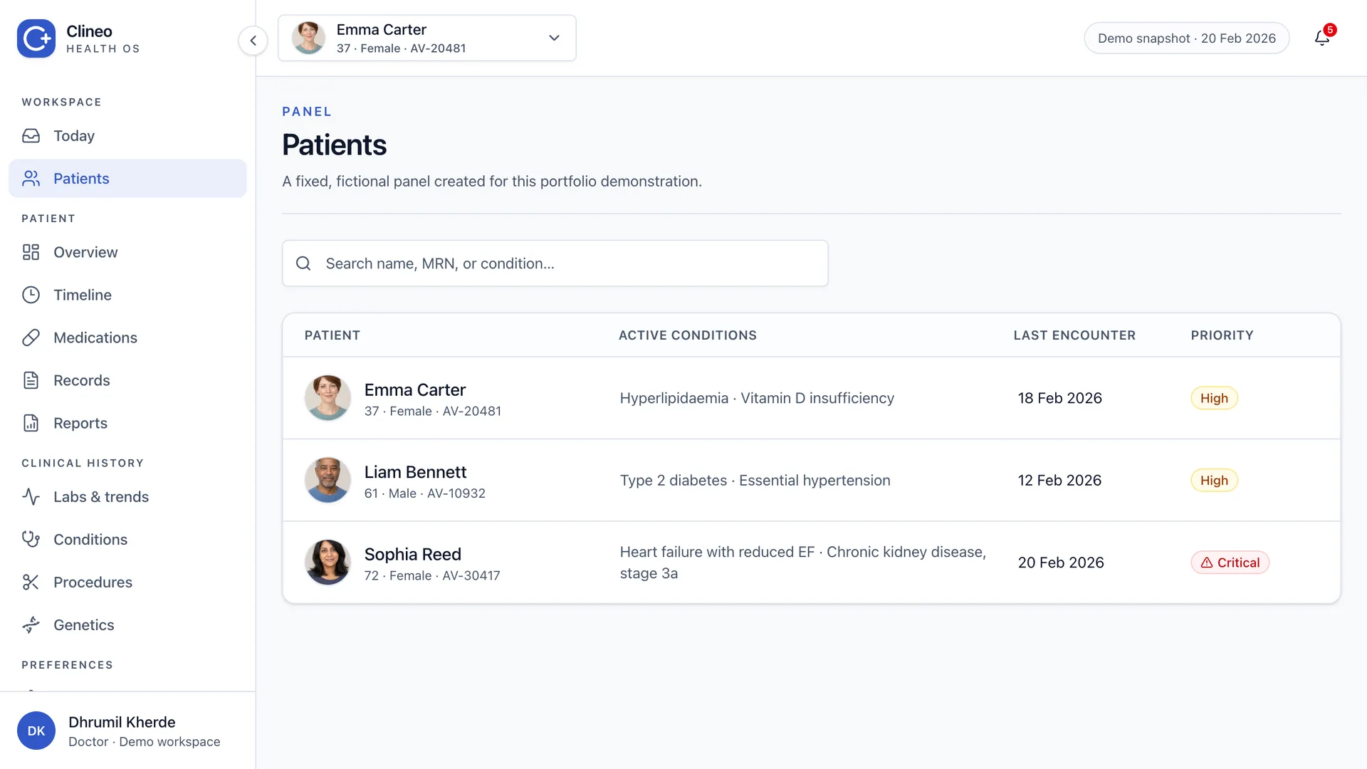
Make the home screen a worklist
The original cards were too wide and too slow to scan. I changed the page into a compact queue, ordered by clinical priority.
Repeated fields now stay in columns. Patient photos help recognition, while text and status labels carry the clinical meaning.
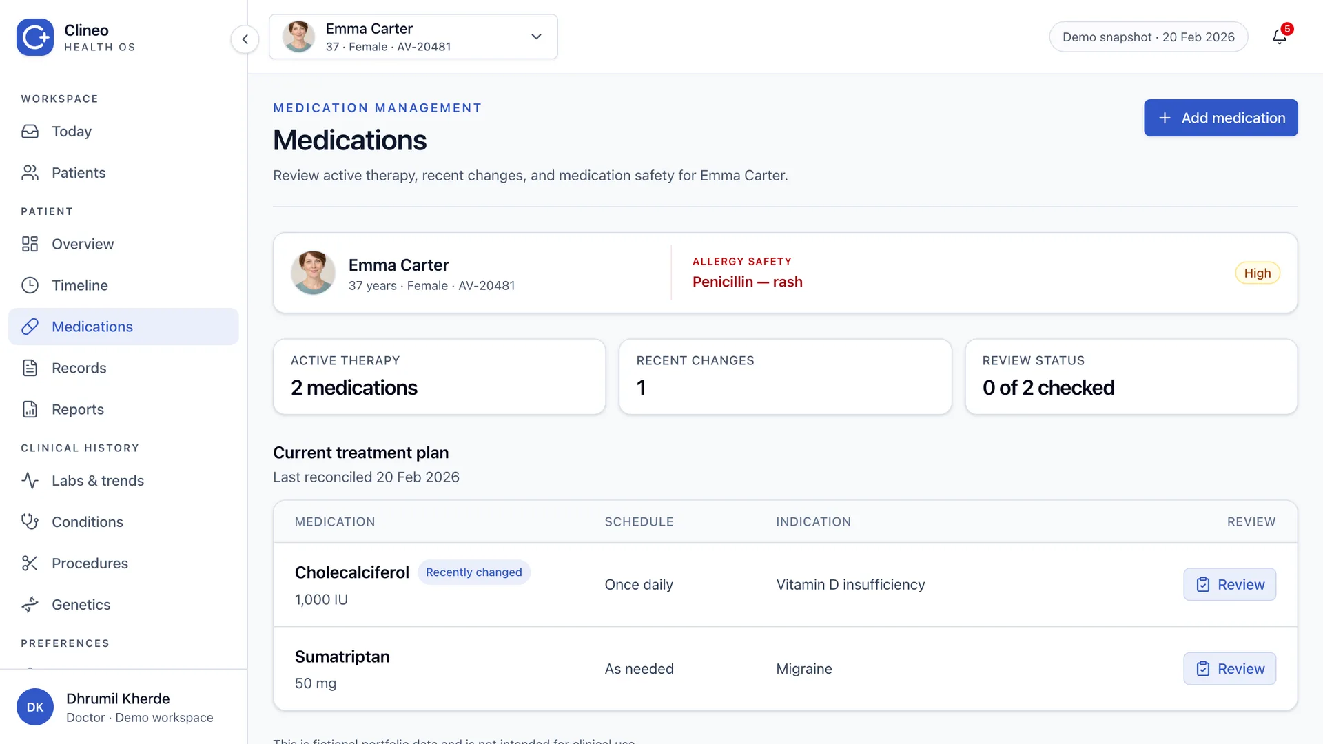
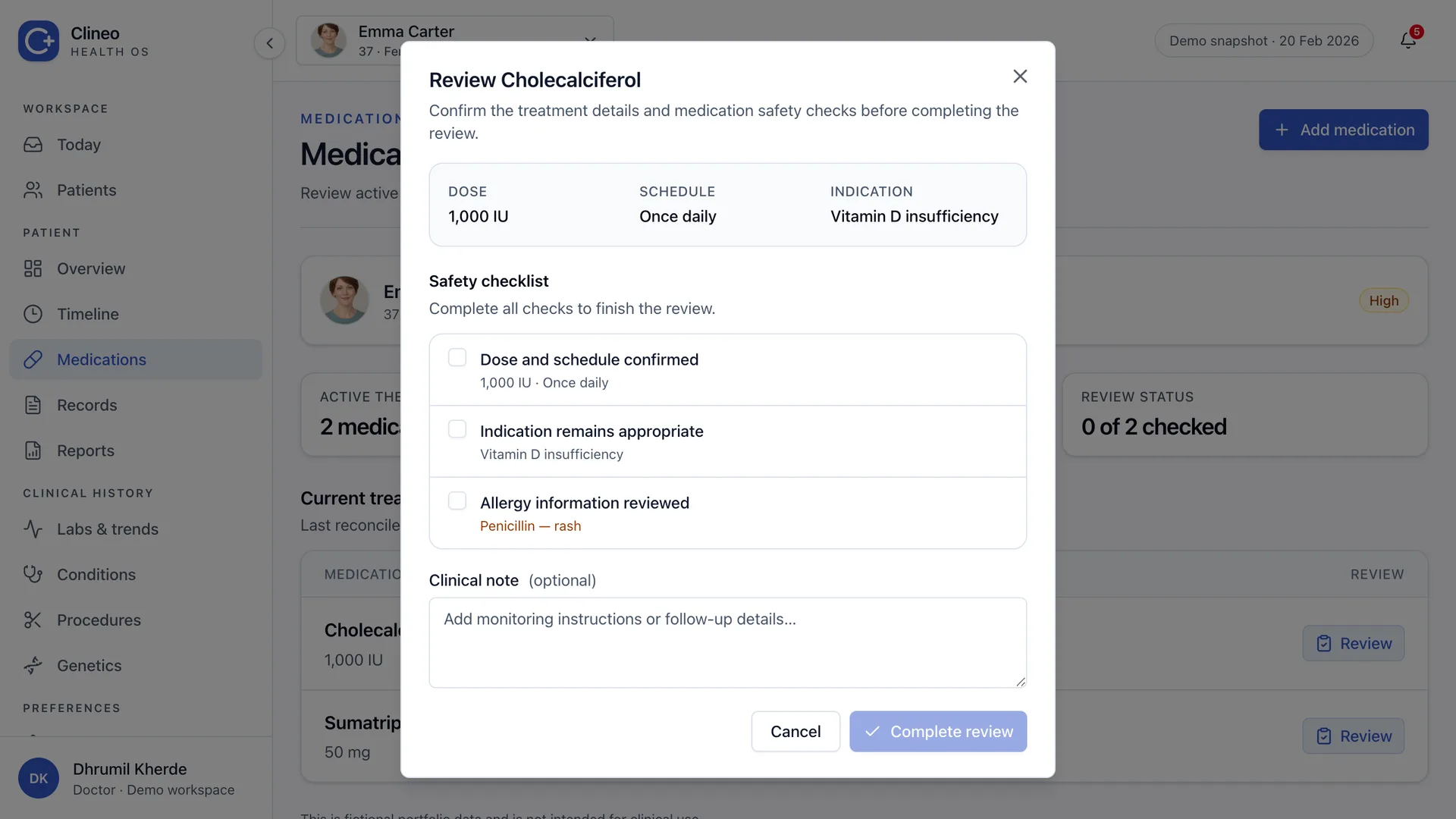
Keep safety context in one stable place
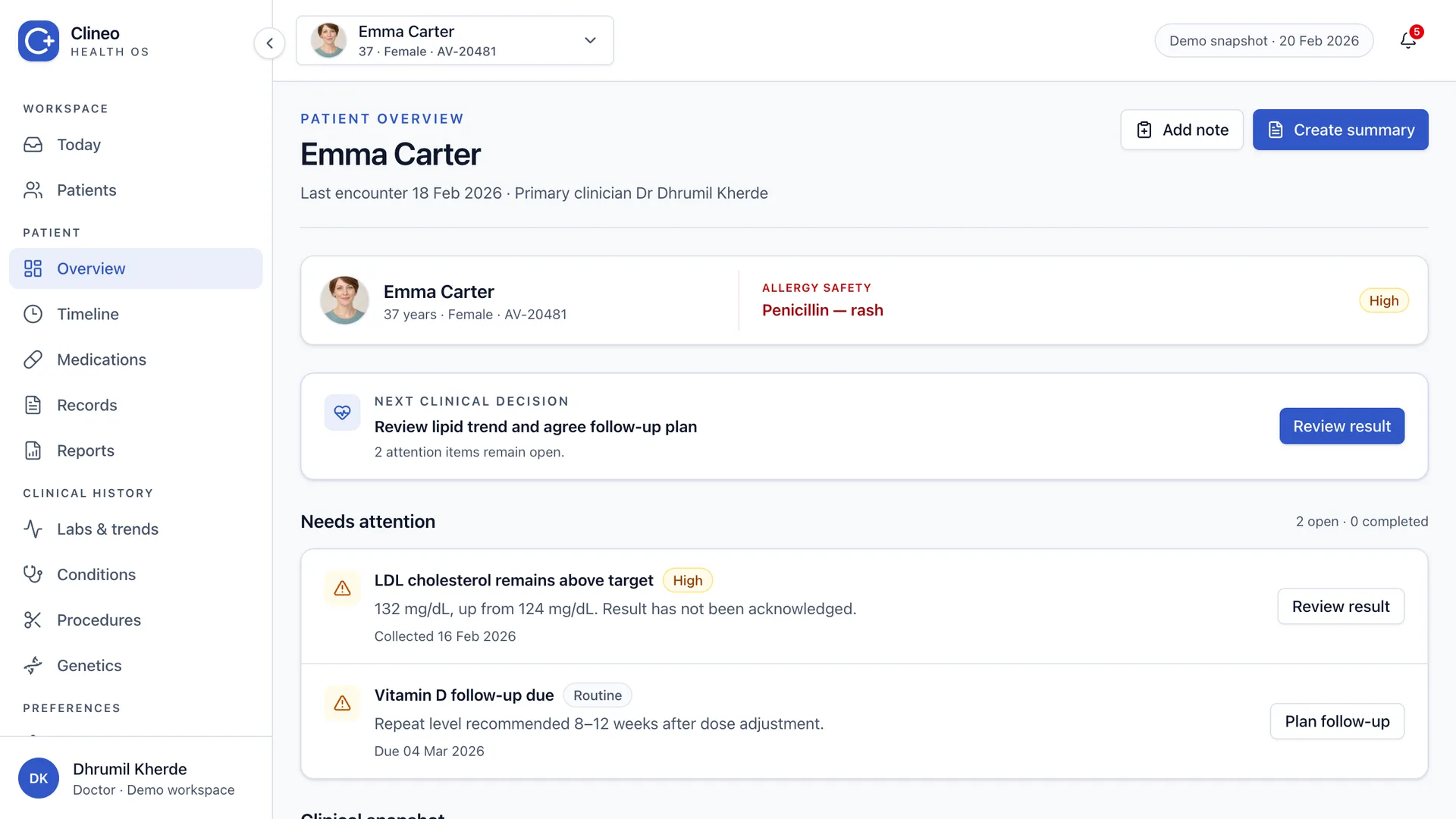
Patient identity and allergy status now begin every patient workflow. The main action sits with the page heading, and the safety area no longer floats at the edge of the layout.
The same structure carries into medication review, so the doctor never has to relearn where critical context lives.
Make time feel continuous
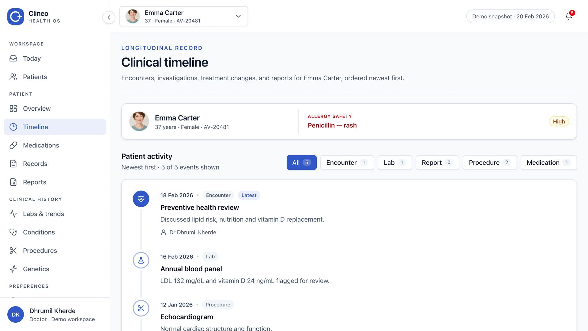
The first timeline used separate date blocks. It looked tidy, but the dividers interrupted the chronology. I rebuilt it around one vertical spine.
The date is now part of each event. The doctor can read down the history without cross-referencing a detached column.
Bring the signal closer to the list
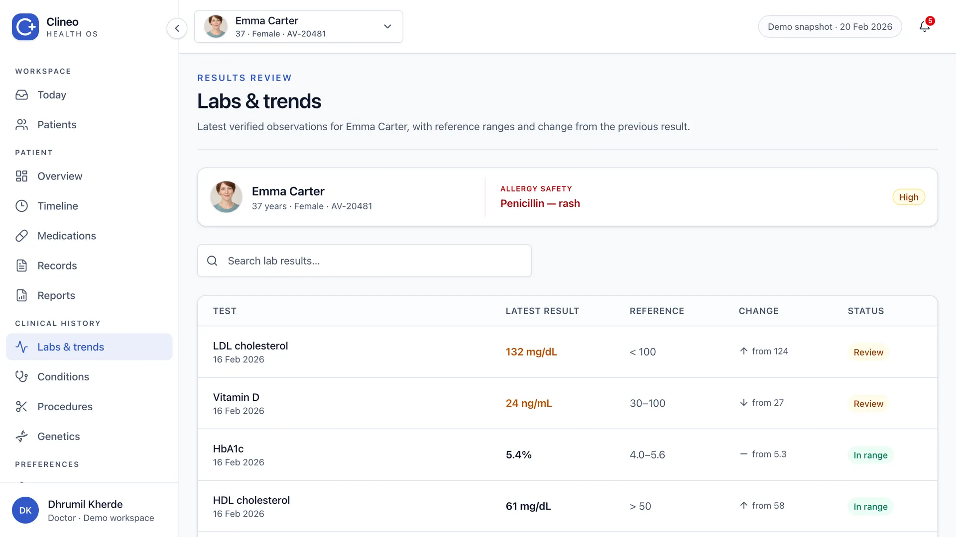
Seeing the direction of one biomarker originally took three interactions. The rebuilt version brings the latest result and its direction into the list itself.
Open the item, switch tab, open the graph.
Latest result and direction, already in the list.
Show review state before sharing
A generated medical report still needs clinical judgement. The list makes processing, review and completion visible instead of treating generation as the finish line.
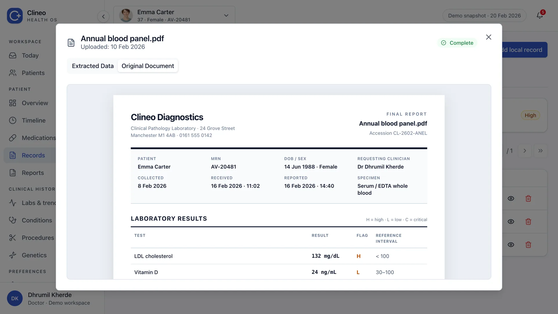
This case study does not reproduce source report content. It shows the workflow and keeps sensitive-looking evidence out of the portfolio.
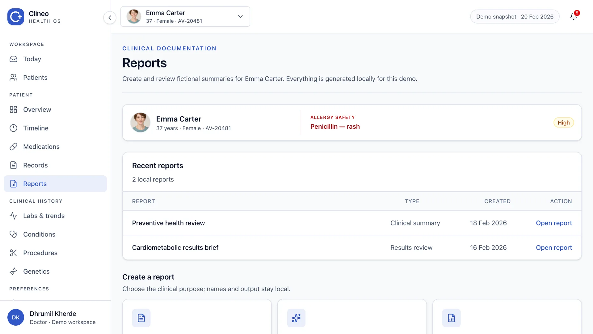
Make every action finish the job
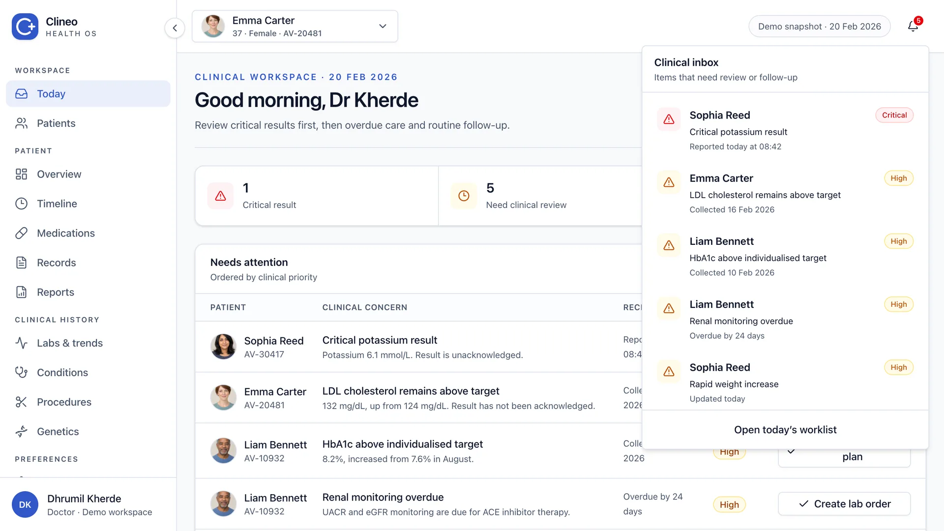
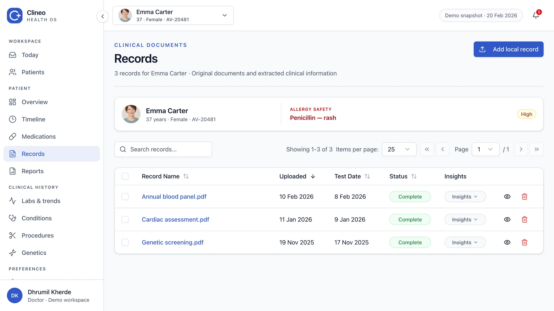
Several actions used to end with a generic toast. In the demo, acknowledgement, review, notes and restored attention items all change the visible state.
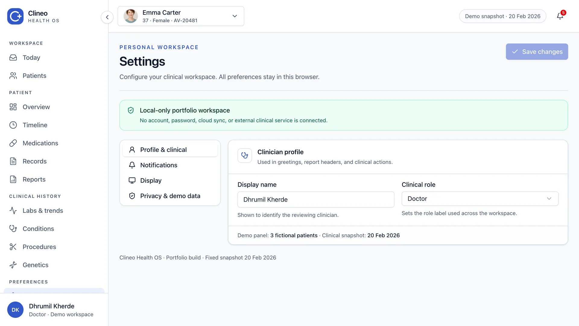
Source records open from the table, and Settings changes the local interface without an account, a password, or an external service.
The report was the end product
The platform was designed to move from scattered source records to one clinician-reviewed health report. That report had to carry the evidence, surface the important findings, and still make it obvious that a doctor was responsible for the final interpretation.
I explored eight report directions against a 28-point review checklist. The direction below became the clearest end-to-end expression of the product: summary first, trends and detailed results second, then recommendations and follow-up.
What changed
By the end of the project the product had moved from disconnected Bubble screens to a reusable React system built around one doctor workflow. Patient review, clinical records and report generation became one thing instead of three separate tools.
Seven clinical modules, plus patient management, billing and onboarding.
A repeatable quality bar for structure, graphs, evidence and clinical readability.
Five sections that gave design and engineering a shared product reference.
What the team said
The work moved quickly, but the feedback I value most was about the quality of the thinking, and about how closely design and implementation stayed connected.
“Outstanding job! In just one week, it felt as though we had been working together for over a month.”
“Dhrumil is an exceptional UI/UX designer and Framer developer with meticulous attention to detail. He delivered expertly crafted, highly interactive designs that were extremely thoughtful from a usability standpoint. His Framer expertise is extensive and practical, allowing him to execute complex ideas quickly and precisely. His communication was clear and professional throughout the engagement and the quality of work consistently exceeded expectations. He is also highly skilled in AI platforms, including Claude Code and Gemini, and brings a modern and strategic edge to his work. Highly recommended to anyone seeking top-tier design talent.”
What changed in my thinking
I stopped designing pages and started designing decisions. That changed how I chose components, wrote labels, positioned actions and judged density. A clean page still fails when the next decision is unclear. A working button still feels broken when nothing visible changes.
The most useful design moves were usually the plainest ones: keep safety context stable, attach dates to events, align repeated fields, and show what happened after an action.
The interface, all together
The individual decisions matter, but the final test is whether the screens feel like one product. These views share the same hierarchy, spacing, safety context and interaction rules.